CASE STUDY — MENDELSSOHN CHOIR OF PITTSBURGH

Redesigning the digital experience for a historic choir

A UX-driven redesign of the Mendelssohn Choir of Pittsburgh's website, built to help members, audiences, and donors actually engage, not just browse.

The 90-second version
Problem
A beloved community choir's website didn't reflect the energy of the group: outdated, hard to navigate, and failing to convert visitors into ticket buyers, donors, or new members.
Method
Analytics review, heuristic evaluation, comparative analysis, and 7 user interviews across singers, audience members, and board members.
Finding
Users needed to hear the choir before committing to anything, and prospective singers, ticket buyers, and donors were each blocked by different, specific friction points.
Outcome
Redesigned information architecture and content strategy shaped the final site, which won a Silver ADDY Award from the American Advertising Federation.
7
interviews
4
research methods
Silver ADDY
award
Role
UX Researcher & Designer
Research & information architecture
Timeline
4 months, 2024
Team
Dot Foundry: UX, Visual Design & Front-End
I led research, IA & wireframes; teammates built the final interface
Client
The Mendelssohn Choir of Pittsburgh
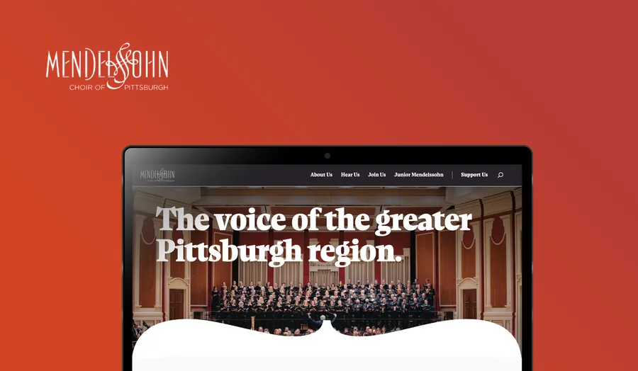
Redesigned Mendelssohn Choir of Pittsburgh homepage on a laptop mockup, reading 'The voice of the greater Pittsburgh region'
The redesigned homepage: choir photography and typography set the tone immediately.
Visit the live site

Overview

The Mendelssohn Choir of Pittsburgh has a long, well-loved history in the community, but their website wasn't doing their music justice. It felt outdated, hard to navigate, and gave new visitors little reason to take action, whether that meant buying a ticket, auditioning, or donating.

I led UX research and information architecture for the redesign, working alongside a visual designer and front-end developer at Dot Foundry. The finished site went on to win a Silver ADDY Award from the American Advertising Federation, recognition for the storytelling and design that grew directly out of the research foundation.

My role

Within a three-person team, I owned the research and structural decisions that shaped the site. Specifically, I:

Ran the full research process: analytics review, heuristic evaluation, comparative analysis, and user interviews
Defined the site's information architecture and content structure
Built wireframes for all core pages
Translated research findings into UX recommendations that guided the visual and development phases

The visual designer and front-end developer then built the final interface (typography, layout, color, and interaction) on top of that structure. The award reflects the full team's execution, but the underlying navigation, content priorities, and user flows are research-driven decisions I made.

Research
Synthesis
IA & wireframes
Visual design
Front-end build
ADDY Award
Research & design process

What users needed to hear, see, and find, and how that reshaped the site.

01 — RESEARCH
Understanding the friction

Despite strong programming and a loyal member base, the old site struggled with unclear information hierarchy, poor mobile performance, outdated or sparse content around auditions and events, and low engagement: donating and buying tickets were both harder than they should have been.

The guiding research question: What do users want to see when they visit, and how do they look for it?
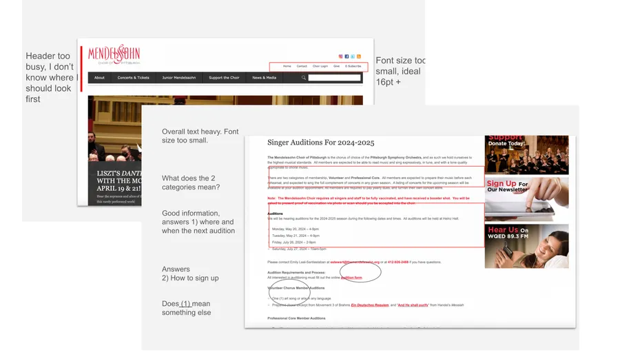
Annotated markup of the old Mendelssohn Choir website, flagging a busy header, small font sizes, and text-heavy pages
Markup of the old site: this is a redlined walkthrough of the original pages, flagging the navigation, hierarchy, and readability issues surfaced during the heuristic evaluation.

I used a mixed-methods approach to triangulate behavioral data with direct user input: Google Analytics and Hotjar to study real traffic and behavior patterns on the existing site, a heuristic evaluation against established UX principles, a comparative analysis of how other arts organizations structured their sites, and 7 user interviews with prospective and current choir members, audience members, and board members.

For the interviews, participants completed real tasks (buying a ticket, finding a performance, looking up audition info) while sharing their screen, which surfaced both behavioral friction and the personal context behind it.
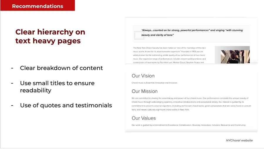
UX recommendation slide: establish clear hierarchy on text-heavy pages, referencing the New York Choral Society website
A UX recommendation based on the findings: establish clear hierarchy on text-heavy pages.
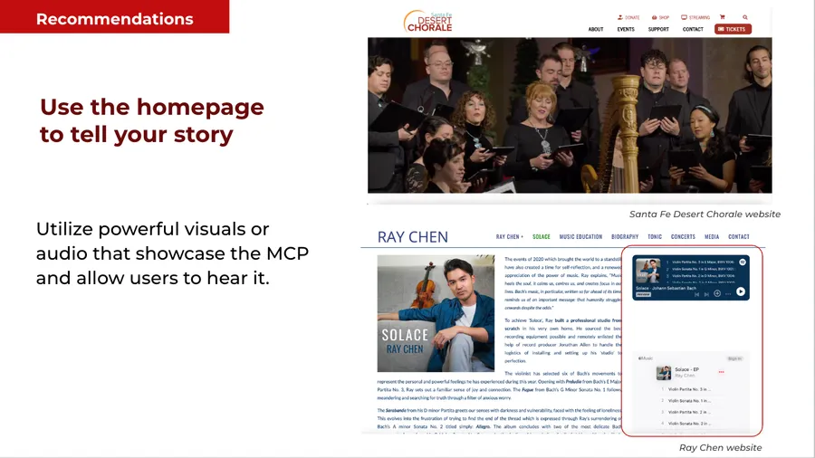
UX recommendation slide: use the homepage to tell the choir's story, referencing the Santa Fe Desert Chorale and Ray Chen websites
A UX recommendation based on the findings: use the homepage to tell the choir's story.
Key findings
People wanted to hear the choir on the website: audio or video felt essential, not optional
Prospective singers needed clear, upfront answers about time commitment and roles before considering auditioning
Event attendees wanted performer and program information front and center, not buried
Font size and the donation flow were consistently difficult, especially on mobile

This led to the core design question: How might we help users quickly find what they need, whether they're attending, joining, or supporting MCP?

02 — STRUCTURE
From research to structure

Based on these findings, I defined a set of UX recommendations that became the foundation for the redesign:

Build a homepage that tells the story through visuals and sound
Break content into clear, scannable sections with subheaders
Reorganize navigation to prioritize upcoming shows, auditions, and support
Improve accessibility and readability, particularly on mobile
Archive past seasons and keep focus on what's upcoming
Information architecture & wireframes

I led the creation of a revised content structure and wireframes for all core pages: translating the research findings directly into navigation, page hierarchy, and content priority.
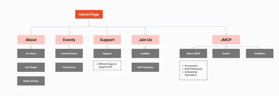
Revised site structure diagram showing the homepage branching into About, Events, Support, Join Us, and JMCP sections
Revised site structure, translating research findings directly into navigation and page hierarchy.
Collaboration & visual design

Once the wireframes were tested and approved, the visual designer and front-end developer built out a modern, cohesive interface (typography, color, layout, and interaction) on top of that structure. The result highlighted the choir's story in a way that reflected the group's role in promoting art, culture, and community. That collaboration led to the site receiving a Silver ADDY Award from the American Advertising Federation.
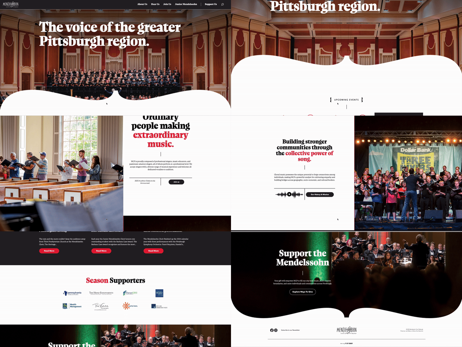
Scroll-through recording of the final Mendelssohn Choir website, showing the homepage and navigation
Scroll-through of the final site, showing the homepage story and navigation in action.

Outcome

The redesigned information architecture and content strategy shaped the final site, which won a Silver ADDY Award from the American Advertising Federation, recognition for storytelling and design that grew directly out of the research foundation.

Before
Outdated site with unclear hierarchy and low engagement
After
Award-winning, story-driven redesign: Silver ADDY, AAF Pittsburgh 2024

Reflection

What I really enjoyed about this project was figuring out how many different jobs one website was trying to do. Someone looking for concert tickets had very different needs from someone thinking about auditioning or supporting the choir. A lot of the work came down to understanding those different perspectives, and finding ways to make each path a little clearer without losing what made the organization feel like itself.
— Grace, UX Researcher & Service Designer
Recognition
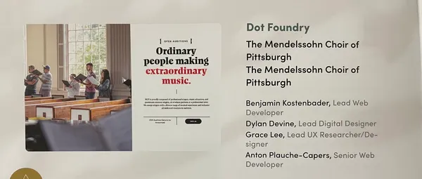
A photographed awards-submission slide crediting the Dot Foundry team behind the Mendelssohn Choir redesign
Project credits from the ADDY Award submission, recognizing the full Dot Foundry team.
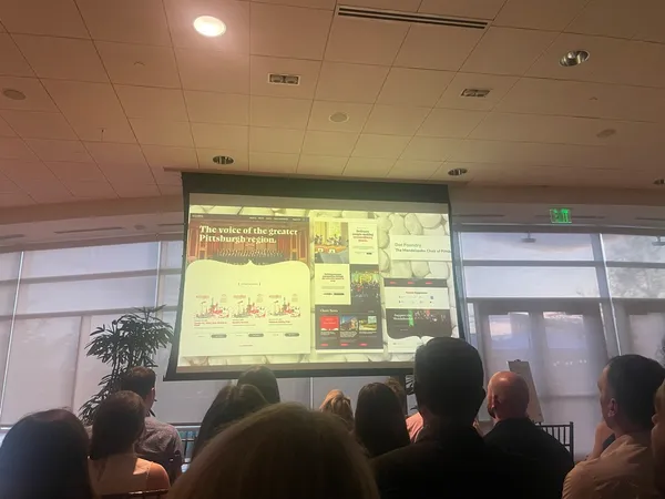
An audience watching a presentation screen showing the final Mendelssohn Choir website design
The winning site design presented on screen at the AAF Pittsburgh ADDY Awards.
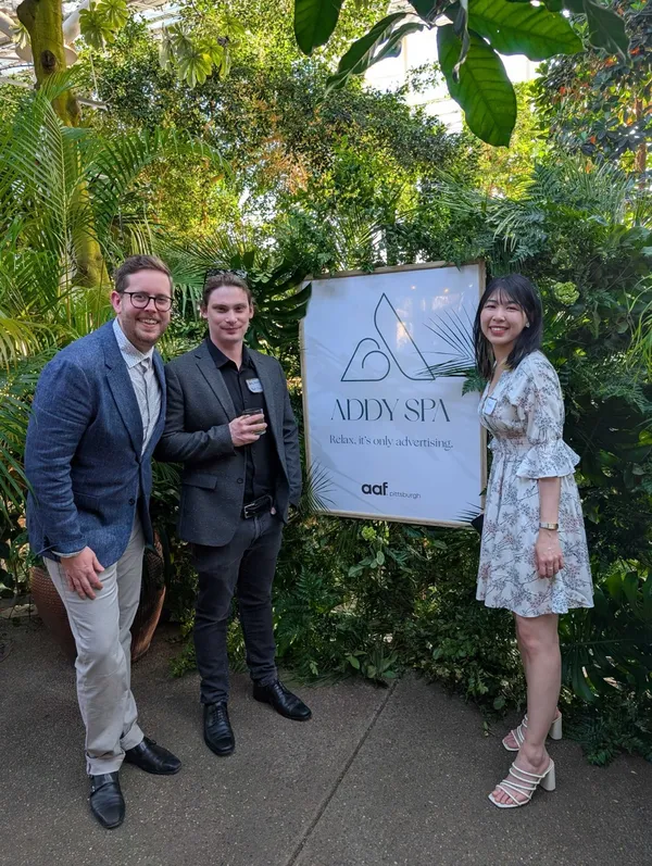
Three people posing next to an AAF Pittsburgh ADDY Awards sign at the ceremony venue
Celebrating the Silver ADDY win at the AAF Pittsburgh awards ceremony with Dotfoundry teammates.

There's always more to the story.

Curious about the research, decisions, or what happened behind the scenes? I'd love to chat.

Say hello